Hawala
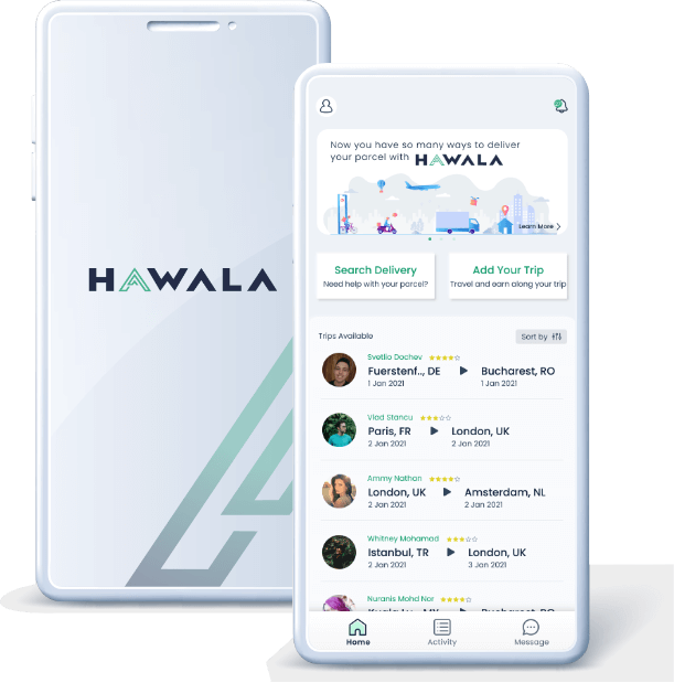
Bridging the gap between travelers and locals for seamless cross-border delivery and purchases. Hawala was built to offer an alternative, more affordable courier service compared to traditional courier companies. Moreover, travelers have the opportunity to earn extra income by advertising their trips and fulfilling local’s delivery and overseas shopping requests.
Date
Sept 2019
Agency
Hawala Inc. (Remote)
Role
UiUx Designer (Generalist)
Deliverables
User experience strategy, Visual Design, Branding and UI style guide.
Overview
Objective
The app’s first MVP was designed by a developer without branding knowledge, resulting in an inconsistent design and lacking some functionality. As the product designer in the team, my priority was to improve the app’s design UI, establish branding, develop a design system for consistency, and along the way evaluate the user experience and refine the user journey.
Identifying the App Needs
When I kickstart with the team, I made an assessment of the MVP and identified three problems that I could contribute to and solve:
- Establish the app branding
- Develop a design system to ensure consistency in the app’s interface
- Identifying user journey gaps through user mapping sessions.
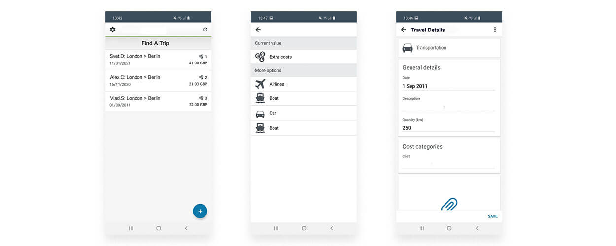
Screen shots from the first MVP
Thought Process
Step 1: Brand Discovery
To establish the new branding for Hawala, I conducted a discovery session with the team to define the brand attributes and shape the app’s visual design. This session was a crucial tool I used to understand every stakeholder’s opinion towards Hawala, and it will help me shape the new branding and interface design.
During the session, I broke the brand attributes into five pillars: culture, customer, voice, benefit, and value. We identified several keywords under each pillar based on our understanding of the app’s pain points and goals. Then, we narrowed it down to the top keyword to represent each of the pillars.
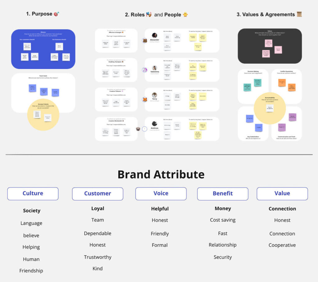
Miro boarding activity
Step 2: Story Mapping
To ensure that the design of Hawala meets the needs of its users, we conducted a second brainstorming session to story-map and identify the challenges and opportunities in creating this app. These sessions gathered valuable insights and feedback from potential users, helping the team understand their needs, pain points, and preferences when inquiring or sending items abroad. A story map was developed to guide the design process, ensuring that Hawala is user-friendly, intuitive, and meets the needs of the target audience.
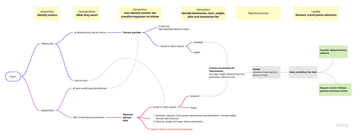
The story mapping board
Traveler Story Map:
- Sign up/log in to the Hawala app.
- Advertise their upcoming trips.
- Browse requests from requesters for delivery or purchase of items.
- Select and accept a request that fits their travel plans and schedule.
- Create a conversation to help the requester.
- Purchase/bring the requested item from the destination country.
- Deliver to the requester and capture evidence the request is complete to receive payment and review.
Requester Story Map:
- Sign up/log in to the Hawala app.
- Create a request for delivery or purchase of an item that is not available in their country.
- Browse profiles of available travelers and select one that is traveling to the desired destination.
- Place the request with the selected traveler.
- Agreed on an amount with the traveler and pay. Money will be put on hold in the app.
- Meet up and receive the requested item, and release payment.
- Leave feedback for the traveler.
More Challanges Discovered
During the story mapping and brainstorming session, we identified and listed several potential issues that the Hawala app may face and need to be solved once the first APK is released:
Security Concerns: There is a risk of fraud and loss of items as users may not have a direct transaction with the traveler and have to trust them to deliver the item securely.
Trust and Reliability: As the transactions are not direct, users may have concerns about the reliability of travelers and the safety of their items.
Delivery Logistics: Coordinating deliveries between different countries, languages, and time zones can be challenging, and there is a risk of delays or miscommunication between travelers and requesters.
Item Regulations: Different countries have different regulations and restrictions on what items can be brought into the country, and travelers may face difficulties in meeting these regulations.
Payment Issues: There may be issues with international payment systems, currency conversions, and different regulations, which can cause complications and slow down the transaction process.
Design Process
Wireframe
After collaborating with the team to redefine user story mapping, I began to redefine the components in the interface. I started by sketching a functional flow to ensure that the user journey is clear and intuitive. Once the functional flow was established, I proceeded to illustrate wireframes for the interface to provide a clearer visual representation of the user journey.
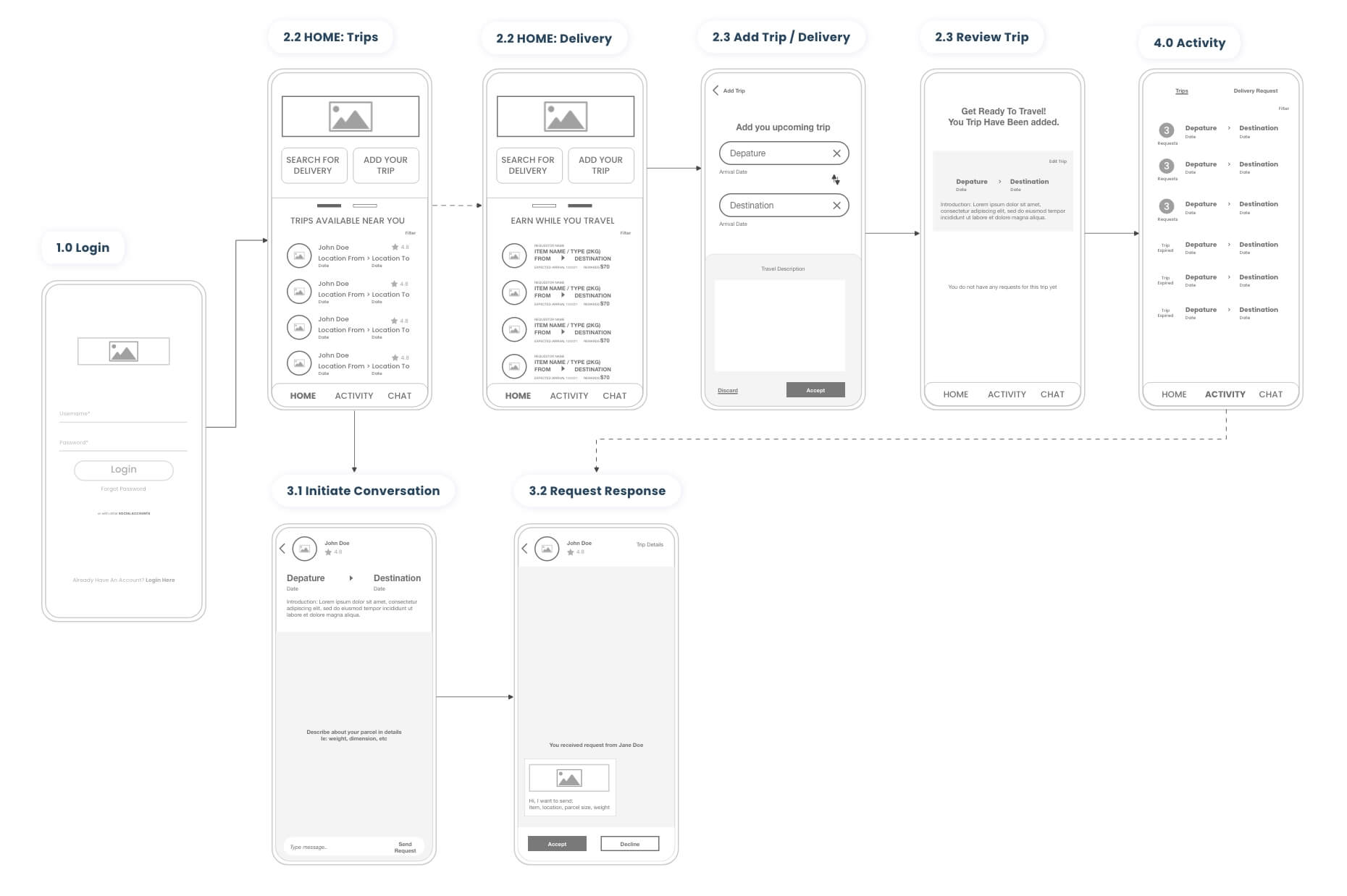
The wireframe for the ‘Traveller’ story map
Branding & Design System
My goal for Hawala’s aesthetics was to infuse the app’s user interface with a fresh and vibrant aesthetic, elevating the overall look and feel of the app. I aimed to create a cohesive and visually appealing design that would enhance the user experience. To achieve this, I proposed a new branding strategy and established a design system that incorporated the brand’s attributes and values.
To establish consistency in the app’s design, I created a design system that included guidelines for the app’s layout, typography, color, and iconography. This system ensured that the design was cohesive and maintained a consistent look and feel throughout the app.
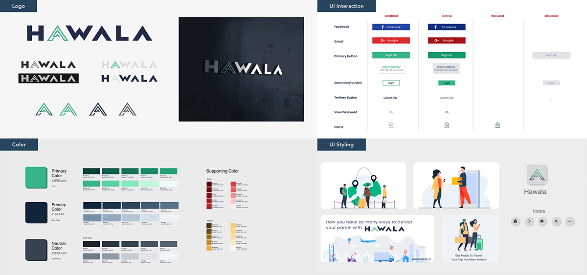
New brand strategy and design system proposed.
Prototype
1. Login > Home > Initiate Delivery Conversation Request
2. Home > Search for Delivery
3. Home > Add trips > View Delivery Requests
Summary & Learning
Working on Hawala was my first experience designing a mobile app, and it taught me valuable skills. Through the design and development process, I learned about the importance of collaborating in a cross-functional team and conducting research and brainstorming sessions with stakeholders to better understand user needs to shape a seamless user journey.
Furthermore, creating visual branding and developing a design system early on in the product stage helped the team maintain design consistency across all screens and saved time and effort that would have been spent on altering the interface. Moving forward, the team can expand the design system as more functionality is added while still maintaining design consistency.
Design Systems are like living organisms that are complex and ever-evolving. What I showed here is just a section of what goes into a complete system. Hawala design is a work in progress but that’s how it’s supposed to be.
My core learnings from this project:
I had the opportunity to work with a cross-functional team from various locations including Germany and Singapore, which helped me enhance my remote collaboration and teamwork skills.
I learned how to use a story map to guide the design process and ensure the app is aligned with user needs and expectations.
I gained experience in conducting user research to understand the needs, goals, and pain points of the target users.
Learned the importance of creating a user-friendly and aesthetically pleasing interface at the early stage of product design. This had a positive impact on time-saving by reducing the need for interface alterations.
©Copyright Nuranis Mohd Nor 2024

